logos of experiments


The CLEO collaboration was formed in the late 1970's. The CLEO detector is located on the electron-positron accelerator/storage ring called CESR (Cornell Electron Storage Ring), located under the camput of Cornell University, see the CLEO home page. I was a graduate student at Syracuse, and a CLEO member from 1979 to 1985, when I got my PhD. Early on, there was a contest for a logo, and I submitted this one, which got chosen. The main intended use was as the front cover for our preprints. In the days before the online preprint archives xxx.lanl.gov, this was the way papers got fast and early distribution. I wanted a page that would be instantly recognizable from a distance amidst dozens of other preprints. The color was the main choice, since at the time there were no other institutes distributing preprints with this color. The logo sat high on the page so that it would still stick out even on a crowded shelf. It also left a large field for the text.

I scanned an old preprint, and cleaned it up a little to better reflect the original colors. The symbol is a schematic representation of the end-view of the detector at the time. It consisted of a large central cylindrical drift chamber, surrounded by 'octants', which were large frames holding a variety of other detectors. The names of the original collaborating institutions formed a horizontal line across the top of the page. In later years, I reworked the page once or twice to add more names.


From Syracuse University and CLEO I moved to CERN, and the Helios Experiment. At the first colaboration meeting I attended there was a vote on the Helios logo, and a design by Ulli Goerlach (at the time with the U of Heidelberg, now at the U of Strassbourg) was chosen.

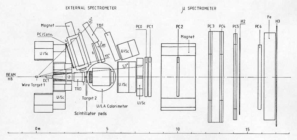
The design is a close representation of the experiment's layout, with lenses for magnets etc.

Helios logo
The Phenix logo you've already seen. Some of the history is here, and the source page for the official red-gray-black images is here.

The name PHENIX was chosen earlier, and the bird theme is obvious. The starburst represents a heavy-ion collision, with particles streaming out in all directions. The horizontal lines in the original design, representing the incoming colliding beams, got lost by the well-intentioned meddling of a collaborator who took the hand-drawn design and made an electronic version. The current official version I made later by writing some PostScript code by hand. The horizontal line is a design element to anchor the top of the page, and is a direct descendent of the line of names in the CLEO design.


One of our Japanese collaborators made this drawing. It shows a Phenix rising from a set of rings representing the Brookhaven accelerator complex. This drawing has been used regularly in Japanese presentations. This emblem was made when the PHENIX-J advertisement brochure was made for budget request purpose. The original draft was made by now-retired Prof. Kohsuke Yagi of the University of Tsukuba, and was brushed up and colored in by an professional artist around Tsukuba (I believe the artist was a graduate of the art department of Univ. of Tuskuba. The emblem was adapted from a very popular comic book ("PHOENIX") in Japan.

Note at the bottom is my original design. Here is a color version, probably the original.


Last update 11 July 2005 - Hubert van Hecke